
Amazon listing optimization: How Supplement Brands can increase Conversion Rates on Amazon in 2026 (Backed by 192 Split Tests)
If you’re running a supplement brand on Amazon, you’ve probably spent a lot of time guessing. You pick product images that look clean and professional, even work with a designer to put together your Amazon listing, and then you wait for the conversions to come. Well, not anymore.
We ran 192 split tests on Amazon supplement listings and surveyed 4,500 real shoppers to find out what actually converts.
Here we’ll break down what we learned, why it matters, and how you can apply it to your own listings today.
DOWNLOAD NOW: THE AMAZON SUPPLEMENTS CREATIVE PLAYBOOK [FREE RESOURCE]
Why Most Amazon Supplement Brands Are Losing Sales Without Knowing It
The supplement category on Amazon is one of the most competitive spaces in e-commerce. There are thousands of brands selling similar products, often with similar claims, at similar price points. In that environment, your best differentiator is your Amazon Images. And these are not just a nice-to-have — it’s one of the most powerful conversion levers you have.
Unfortunately, some supplement brands on Amazon are making creative decisions based on what looks good to them not on what actually converts for their customers. And that gap between “we think this works” and “we know this works” is exactly where sales are being lost every single day.
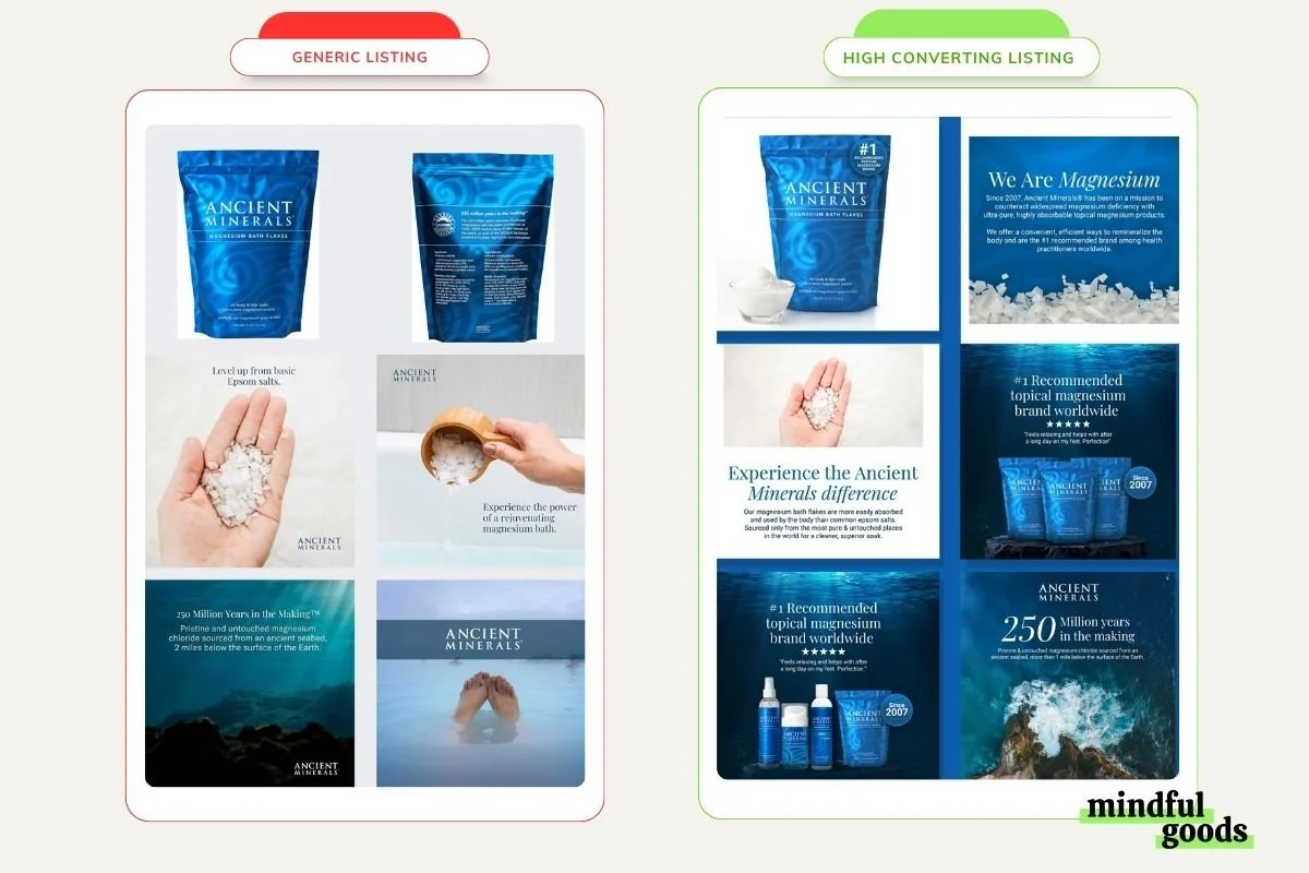
A generic Amazon listing Vs An optimized listing built for conversion
That’s why we decided to stop guessing and start testing. We ran 192 split tests on Amazon supplement listings, surveyed 4,500 real Amazon shoppers, and analyzed winning listings across 16 supplement sub-categories. What we found surprised us — and it will probably surprise you too.
How we create High Converting Amazon Listings for Supplement Brands
Two words - Split Testing.
A lot of brands make the mistake of going straight to Amazon Experiments to test their creatives.
But If you upload an untested creative directly to your Amazon listing, you’re gambling with your conversion rate in real time, which affects your organic ranking and ad efficiency before you even have enough data to know what went wrong. On top of that, Amazon Experiments can take up to 12 weeks to return significant results. Most brands simply can’t wait that long.
Instead, we use PickFu as our primary split-testing platform. It gets us feedback within 30 minutes and lets us target the exact customer avatar we’re designing for — actual Amazon Prime members filtered by purchase behavior, demographics, and lifestyle. After validating a creative with PickFu, we move it to Amazon Experiments for live confirmation. This two-stage approach is the foundation of our six-step process, which we break down in full inside the playbook.
And the proof is in the numbers — 75% of the creatives that test well on PickFu go on to actually increase sales on Amazon. That's a dramatically better starting point than guessing.
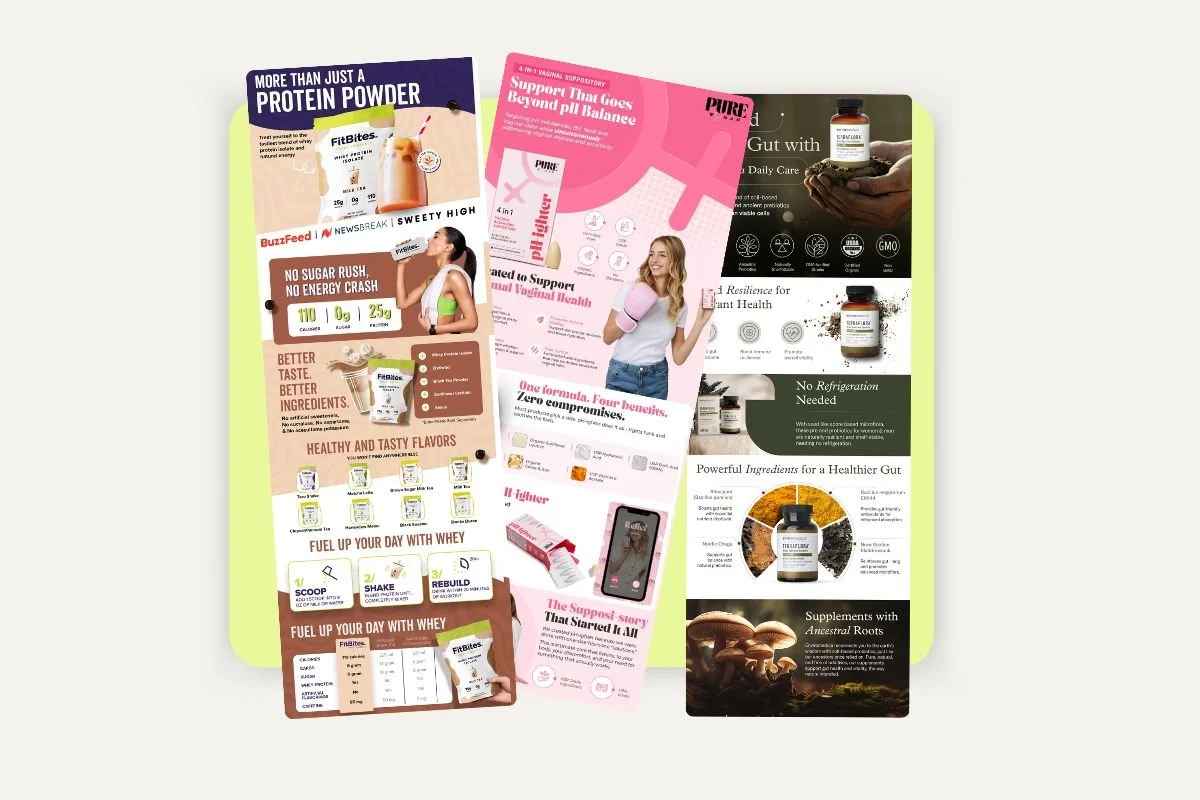
Which Amazon Supplement Image Types Actually Drive Conversion
After analyzing 99 PickFu polls, 4,600+ real Amazon Prime shoppers, and 38+ supplement brands, the same themes kept coming up.
Here's what the data actually says about what converts — and what doesn't.
1. Show what's inside
Transparency wins every time. Images that showed the actual capsule, powder, or prepared product won in 90%+ of tests where this was a variable. Supplements are something people put in their body — uncertainty about what they're consuming is the #1 conversion killer. Packaging-only shots consistently lost. The moment you show a capsule outside the bottle, a scoop of powder, or a drink already in a glass, trust goes up and hesitation goes down.
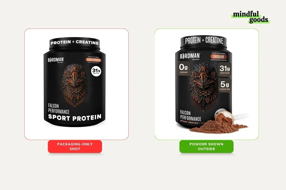
An example of package-only shot vs Showing what’s in the container
2. Ingredient imagery isn't decoration. It's a conversion trigger
Fruit, vegetables, and natural source materials appeared as a purchase driver in 70%+ of winning poll responses. Shoppers aren't buying a product — they're buying the story of what went into it. An electrolyte drink shown in a glass with fruit slices won with 77%, the highest single-poll win rate in the entire dataset. That's not a design preference. That's a revenue signal.
3. For consumable formats, show the end result — not the raw product
Across every beverage and powder category, showing the finished, ready-to-drink product in a glass outperformed showing the powder or packaging alone. Every single time. A protein shake shown as a finished chocolate drink won with 67% over the powder-only shot. The insight: shoppers want to picture themselves using it. Give them something to picture.
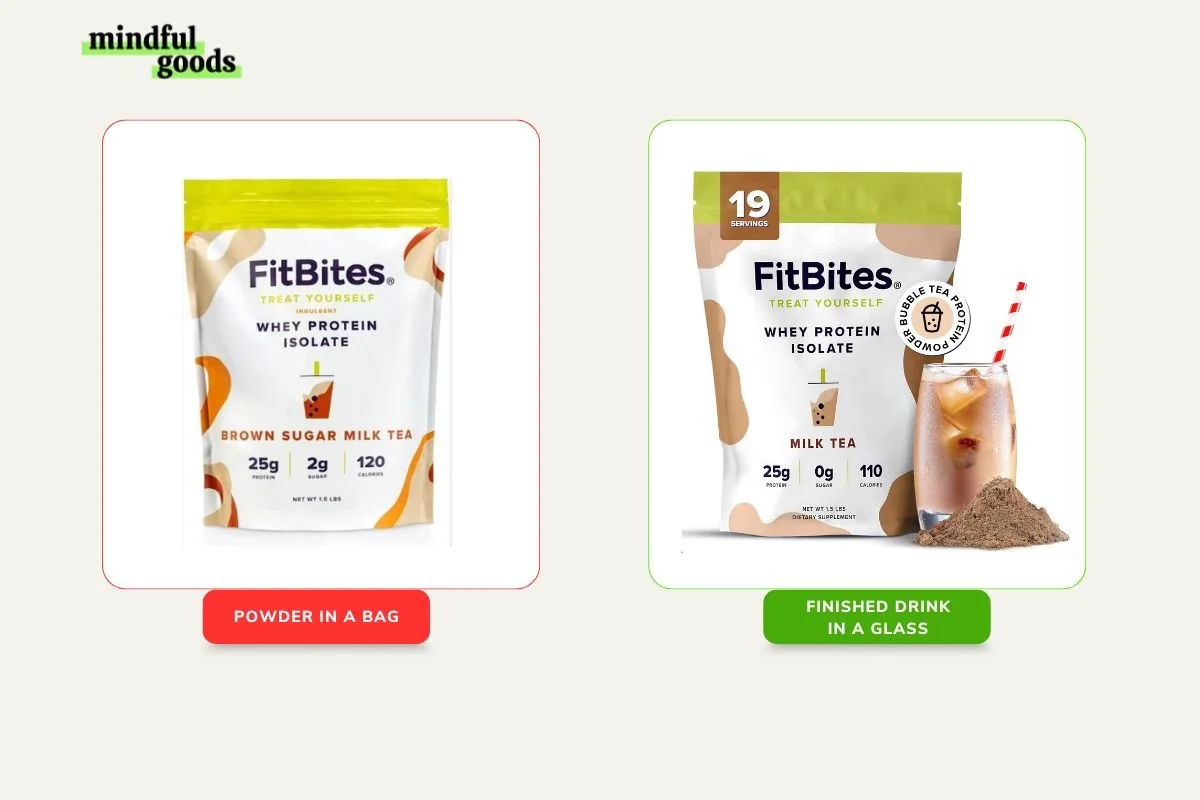
A sample of an Amazon supplement brand listing that shows what the end-result looks like
4. Vibrant, on-brand color beats neutral in every category, every time
In 11 of 12 full image stack polls, the more visually dynamic option won. Neutral backgrounds and minimal design were consistently described as "generic," "plain," and "doesn't grab me." Color isn't just branding — it's the first trust signal a shopper receives before they read a single word.
5. Mechanism matters as much as the benefit claim
In complex supplement categories — lipoic acid, magnesium, sleep powders — infographic slides explaining how the supplement works were cited directly by respondents as decision-influencing content. Shoppers aren't just asking "does it work?" They're asking "how does it work, and does this brand understand the science?" Winning stacks answered both. Listing benefits isn't enough — showing the science visually is what separates credible from generic.
6. Trust signals work, but only when they're designed in — not bolted on
Clinically tested, Non-GMO, Made in USA, Clean Label — these all moved the needle. But the key variable wasn't whether to include them. It was how. Winning images had badges that felt designed into the creative. Losing images had badges that looked like afterthoughts. The placement and integration of a trust signal matters as much as the signal itself.
7. In commodity categories, brand recognition creates a moat
When a recognized brand appeared in the poll, it won based on name alone in a meaningful share of responses. In the vaginal health test, "brand" was the most-cited keyword in winning responses — more than any product feature or design element. For challenger brands, the implication is clear: you need to be more informative and more visually polished to close that gap.
8. Women's health shoppers buy identity, not just ingredients
Across six polls targeting women, the winning stacks weren't just more informative — they were more identity-congruent. "Women-owned" branding, real lifestyle models, and warm relatable imagery consistently outperformed clinical white-background approaches. The winning creative made shoppers feel: this was made for someone like me.
9. For pet supplements, show different breeds
Multi-breed imagery won in 4 out of 4 pet supplement tests. Single dog images lost. Breed diversity communicates universal product fit without a single word of copy. Cute, happy dog faces outperformed clinical product shots even when the clinical option had stronger benefit callouts.
10. Visual-first A+ content wins below the fold 100% of the time
Every single A+ content poll was won by the more visual option. Text-heavy A+ layouts were called "overwhelming," "a turn off," and "awful for readability" — even when they contained more information. The lesson: the delivery vehicle for information matters as much as the information itself.
Some examples of Visual-first Amazon A+ content
Safe to say that the brands getting conversions on Amazon right now aren’t just creative, they’re structured.
How To Apply These Insights To Your Amazon Supplement Listing Today
So here’s what you can do to make sure your brand gets market share on Amazon.
Do an Audit
Start with an honest audit. Are your images answering the questions shoppers are actually asking? Is your listing sequence aligned with how shoppers in your sub-category browse? If you don’t know how to go about it, our mini audits are your best bet to have expert eyes on your Amazon page.
You can have us review your product page today
Test, test and test your creatives first
From there, identify the one or two changes most likely to move the needle, build two or three creative variants, and test them with PickFu against your exact customer avatar before anything goes live. Rapid, data-backed improvements without ever risking your live conversion rate. Data beats guessing on Amazon.
Use the Amazon Supplements Creative Playbook
And if you want the full picture of image types, design elements, listing structures, and A+ strategies across all 16 sub-categories, that’s exactly what the Amazon Supplements Creatives Playbook is built for.
Get the Amazon Supplements Creatives Playbook for free
We built this because we were tired of watching great supplement brands underperform on Amazon, and over 15,000 supplement brand owners, marketers, and Amazon sellers have already downloaded it.
Inside, you’ll get the full breakdown of what our 192 split tests revealed: the image types that close the conversion gap, the design elements that hurt performance even when they look great, the A+ content strategies that won consistently, and how the highest-converting listings are structured right now. Plus our complete six-step testing process.
It’s free. You can get a copy here. And say goodbye to guessing.