
The Best Amazon A+ Content in the Beverage Category: Our Full Top 11 List

We covered our top picks on YouTube — six brands we think are doing A+ content better than almost anyone else in the beverage category right now. But we promised the full list on the blog, so here it is.
A bit of context: at Mindful Goods, we work with roughly 150 direct-to-consumer brands every year on their Amazon creative — product images, listing copy, A+ content, storefronts.
We're constantly studying what converts, running split tests to validate it, and building a swipe file of the best examples we find across every category. Beverage is one of our favorites because the range is so wide — premium non-alcoholic spirits, functional energy drinks, loose-leaf tea — and the brands doing it well are genuinely doing something interesting.
Some of these brands are clients. We'll say so when they are. The rest aren't, and our opinion doesn't change either way.
If you'd rather watch than read, we broke down every single one of these examples on YouTube. Watch the full breakdown here.
1. Juni
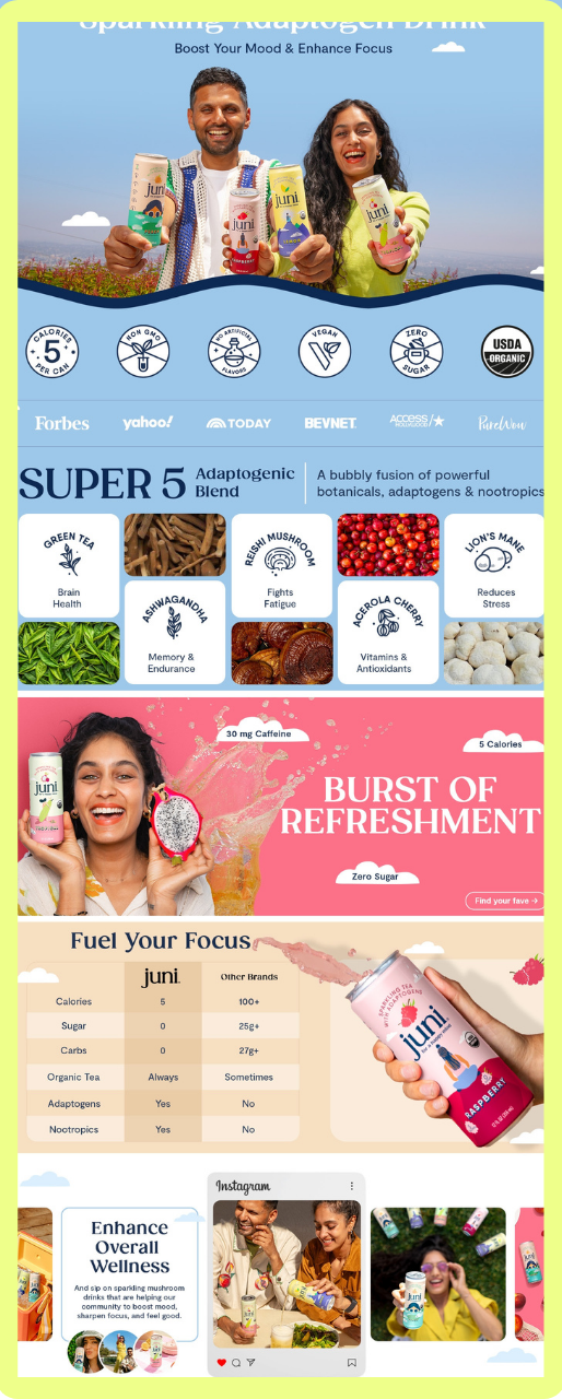
Source: Juni
By the way, Juni was one of our clients. Yes, we designed this.
The first thing you notice on Juni's A+ content is what's not there: no badge wall, no ingredient callout grid, no "why we're better" copy right out of the gate. Instead, you see the founders — Jay and Roddy — in a lifestyle image. If you know who they are, the trust factor goes up immediately. If you don't, the warmth of the image still does its job.
From there, everything has room to breathe. Headers, subheads, callouts — but none of it crowded. You can scan the whole thing in about 30 seconds and walk away knowing what the product is, what's in it, and why you'd choose it.
The us-versus-them comparison module is the standout element. Rather than just listing "5 calories per bottle," the comparison table gives those numbers a frame of reference. The shopper can instantly see what 5 calories means relative to the alternatives. That context is what makes the spec feel meaningful instead of just another bullet point.
At the bottom, UGC content brings in the community they've already built on social. If you're investing in creator content on Instagram or TikTok, there's no reason to leave it off your Amazon listing.
Key takeaway: A comparison module works best when you show the competitor data, not just your own numbers. The context is what converts.
2. Rishi Tea
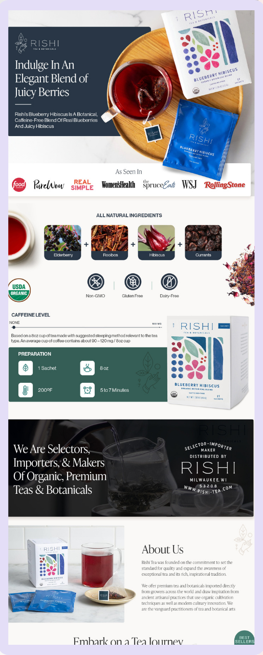
Source: Rishi Tea and Botanicals
Rishi is another one of our clients. Rishi has a large catalog, strong media coverage, and a loyal following — and their A+ content earns all of it.
The structural move worth stealing: the first two banner modules are designed to combine into one full-width hero image. When a shopper scrolls down from the product carousel and hits the A+ section, the combined image stops the scroll. We've used this approach across a lot of our work and it consistently performs.
Media mentions come in right at the top. When you have press coverage, lead with it. It shortens the trust-building process for a shopper who's never heard of the brand.
The cross-selling module at the bottom is specific to where this shopper is in their buying journey. We knew they were browsing a particular type of tea, so we surfaced the best sellers in that category — a curated recommendation that maps to what they were already looking at, not a generic "you might also like" dump. That's how you increase average cart value without it feeling like a sales tactic.
Key takeaway: Know your catalog strategy before you design your A+ content. Cross-selling works when it serves the shopper's journey, not just your catalog coverage.
3. Bero
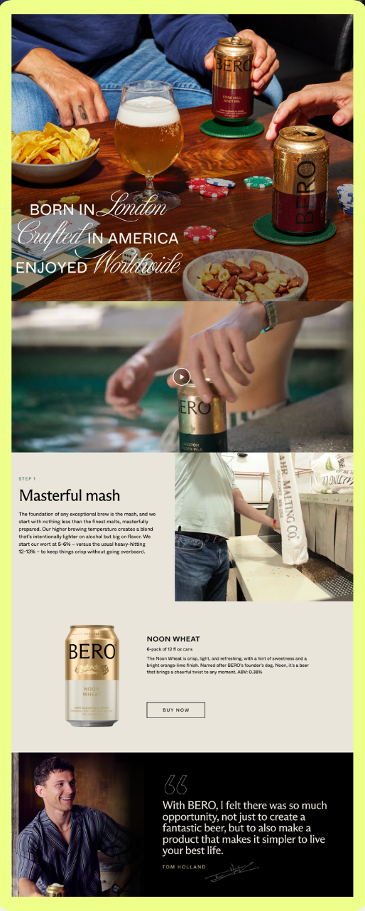
Source: Bero
Bero is Tom Holland's non-alcoholic beer brand, and the A+ content communicates that positioning before you read a single word.
The color palette — deep greens, muted golds, textured editorial photography — signals premium from the first frame. This level of photography quality takes real investment and it can't be shortcut with AI-generated imagery, at least not yet. The images set the price expectation for the whole page before any copy has a chance to.
The brewing process module is one of the better examples of behind-the-scenes content we've seen on Amazon. For a shopper who doesn't drink alcohol and genuinely wonders whether a non-alcoholic beer can taste good and feel worth paying for, this section answers the question without overselling it. The images show the work. The work makes the case.
Press mentions (Forbes and others) come at the end. Rishi leads with them; Bero saves them for the close. Both approaches work. What matters is having them somewhere on the page.
Every module in this listing pulls the same direction: premium. There's no off-note in the design. That consistency is rare and it shows.
Key takeaway: A step-by-step process module is worth building when your product has a story behind how it's made. Transparency about the process is its own trust signal.
4. Ryde
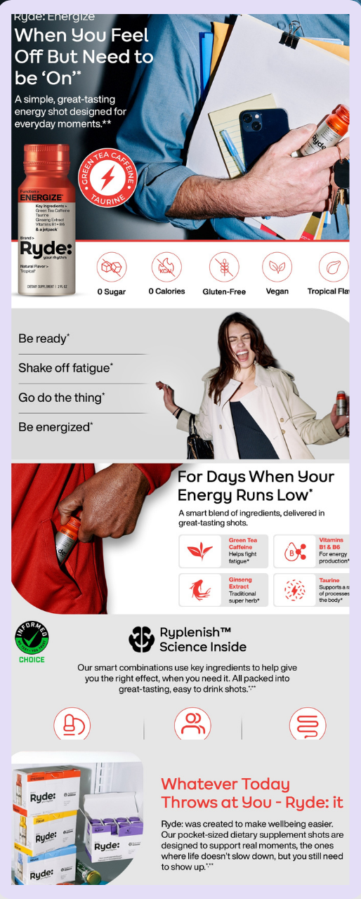
Source: Ryde
Ryde is another brand we had the pleasure of working with at Mindful Goods. It is a functional beverage for the busy person who needs focus and energy. The A+ content knows exactly who it's talking to.
The hero shot is clean and specific — a product-forward image that calls out the core USP without clutter. From there, the hierarchy stays consistent all the way down: main header, subhead, supporting callouts. Rinse, repeat. Nothing makes you stop and re-read because nothing is fighting for attention.
UGC content comes in partway through. Same principle as Juni: if you're already creating this content for social, bring it into the listing.
The cross-selling module here takes a different approach than Rishi's. Rather than a product grid, it shows the full product family in a series of lifestyle moments — different functions, different occasions. The viewer gets curious about the variants and has a reason to explore the catalog. That's a subtler approach to cross-selling that works well when your range spans different use cases.
Key takeaway: Consistent visual hierarchy across every module is what makes A+ content scannable. Header, subhead, callouts — repeat that structure and the shopper can move through it in seconds.
5. Hiyo
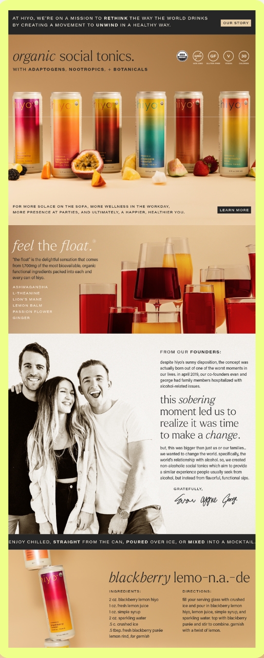
Source: Hiyo
Hiyo opens their A+ content with six cans on a warm sandy background, each paired with a fresh fruit. No text, no claims. Just a beautifully shot product lineup. Sometimes the strongest thing you can do in your A+ content is let the product breathe and trust that great photography carries the weight.
The "Feel the Float" section is what we think about when we talk about selling a feeling instead of a product spec. Hiyo named the experience you have when you drink it and built a whole content section around that name. It separates the brand from a commodity. You remember "Feel the Float" after you leave the page. You don't remember "4g adaptogens per can."
The founder story section is the most unusual thing about this listing, and probably the most effective.
The founders share the personal moment — a family member's hospitalization — that sparked the idea for Hiyo. That level of honesty on an Amazon listing is rare. It works because shoppers can tell the difference between a real story and a polished brand narrative. When the story is genuine, it gives people a reason to choose you over every other brand on the shelf.
Key takeaway: If your product creates a specific feeling or outcome, name it. Own that language. It's what separates a brand from a commodity.
6. Gorgie
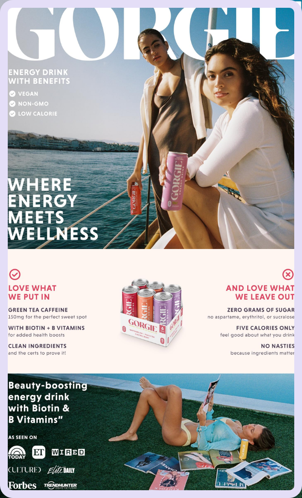
Source: Gorgie
Gorgie’s A+ content is a clean, focused launch execution that gets the fundamentals exactly right without overcomplicating them.
The photography has a distinctive grainy, film-like quality that gives the whole thing a magazine-cover feel. It's a specific aesthetic choice — not the default clean product-on-white that most new brands start with. The poolside lifestyle imagery is selling a version of the shopper's life, not just the product. For a beverage competing in the "how do you want to feel" category, that's always a more effective opening than a list of ingredients.
The color system — electric teal, hot pink, cool blues and greens — is a deliberate contrast to most energy drink branding, which runs dark and aggressive. Georgie goes bright and inviting. The choice signals exactly who they're selling to.
The content scope is right for where the brand is. A clear intro module, what's in it and what's left out, a media mention anchor at the bottom. For a brand in launch phase with one hero SKU to move (the variety pack), this is the correct scope. You don't need carousels and cross-selling modules when you're still building brand recognition.
Key takeaway: If you're in launch phase with a small catalog, focus on one goal: introduce the product and get people to try it. A clean, focused A+ execution outperforms an overcomplicated one every time.
7. Kochere
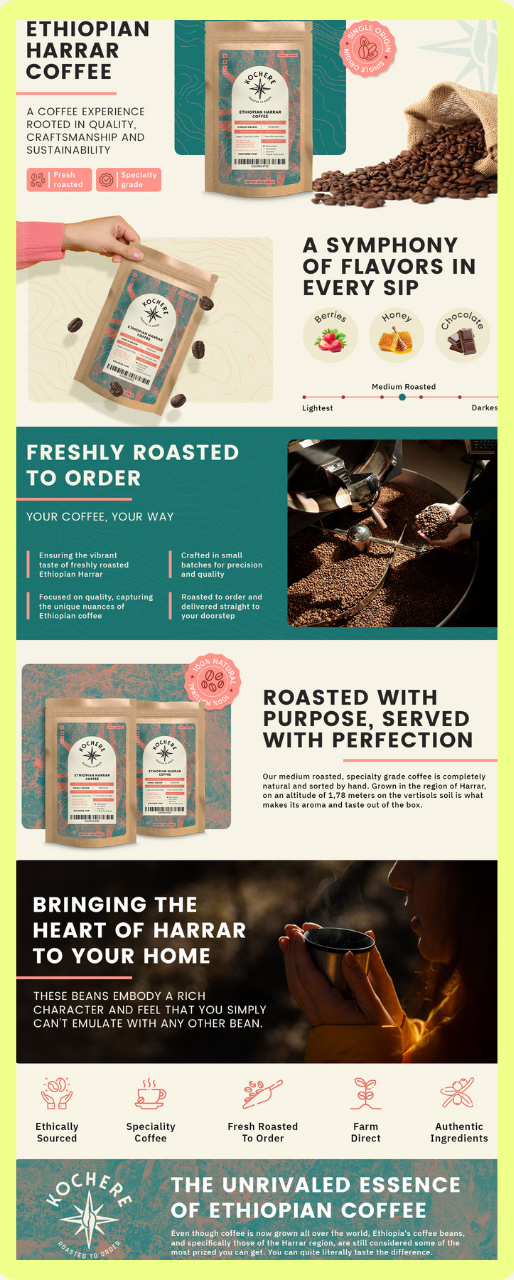
Source: Kochere
Kochere is another one of our clients on this list. Yes, we designed this.
Kochere's A+ content works like a mini landing page for their coffee, and the job is to show shoppers what makes them different, not just tell them about it. Their USP is simple: they don't pack the coffee until you order it, so it stays fresh. Instead of just writing that as a bullet point, they show the actual roasting process, the beans, the machine, someone at work. You see the freshness claim happening instead of just reading it.
And the flavor wheel and roast scale do the same job for taste. It shows you exactly where it sits on a scale and which flavor notes to expect instead of telling you the coffee is smooth or fruity.
Their A+ content is worth studying if you're in a crowded product line, like coffee, and need your differentiator to actually stand out. For Kochere, that's not packing until you order.
8. Recess
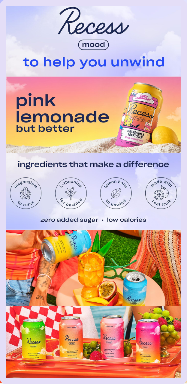
Source: Recess
Recess built one of the most distinctive brand identities in the functional beverage space — pastel, soft, calm — and their A+ content extends that world exactly as it should. The palette, the copywriting tone, the lifestyle imagery all feel continuous with what they've built on social and their website. That consistency across channels is harder to achieve than it looks, and Recess does it well.
Worth studying for how a strong DTC brand identity translates to Amazon without losing anything in the process.
9. Brez
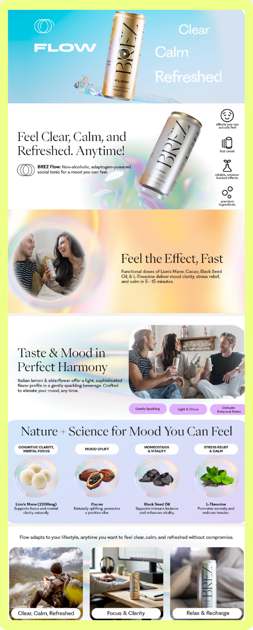
Source: Brez
Brez is a THC/CBD beverage with a clean, minimal design language that stands out in a category that tends to overcommunicate. Their A+ content doesn't lean on the ingredient dump that most functional beverages fall back on. Instead, it leads with the experience and lets the minimal aesthetic do the work of communicating quality.
Brez’s A+ content is worth studying for how to communicate wellness positioning without crowding the page with certifications and callouts.
10. De Soi
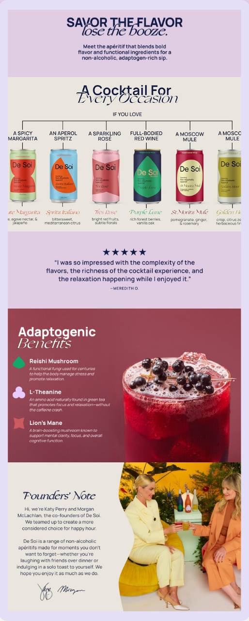
Source: De Soi
Katy Perry and Morgan McLachlan's non-alcoholic aperitif brand.
Premium, French-inspired, grown-up in a way that most beverage brands on Amazon aren't. The visual identity is strong enough that the A+ content doesn't have to do heavy lifting — the brand arrives with a clear point of view and the content supports it.
De Soi is worth looking at an example of how celebrity founder brands translate premium positioning into the Amazon format.
11. Parch
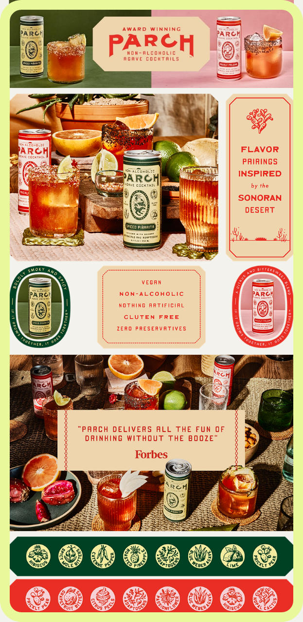
Source: Parch
Parch is a non-alcoholic agave spirit from Arizona with an earthy, artisanal aesthetic rooted in regional identity. Their A+ content carries the craft and provenance story in a way that feels honest, not manufactured. It's a good example of how smaller, founder-led brands can use the A+ format to tell a story that a big CPG brand simply can't tell.
Definitely worth studying if you're a craft or regional brand trying to figure out how to communicate what makes you different on a platform that tends to flatten everything.
What All of These Have in Common
The brands on this list aren't just visually impressive. Most of them are doing structural things right: combining hero modules at the top to stop the scroll, building comparison modules that give specs real context, anchoring with media mentions, pulling in UGC that they've already invested in creating, and cross-selling in a way that actually maps to the shopper's journey.
Those are the moves that show up in conversion data. We know because we split test them.
If you're an Amazon brand in the beverage category and want to know where your A+ content stands, use this list as a benchmark. Find the brand whose audience most closely resembles yours and ask: does my content do what theirs does?
If the answer is no, that's where to start.
Mindful Goods is an Amazon creative services agency. We've worked with 150+ DTC brands on their product images, A+ content, listing copy, and storefronts. You can learn more about our services here.