
10 of the Best A+ Content Examples From Food Brands on Amazon

I'll be honest: I did not go into this roundup hungry, and I came out of it raiding my pantry. That's kind of the point. In the food category, if your A+ content doesn't make someone's mouth water a little, it's not doing its job. People can't taste your product through their screen, so your content has to do the tasting for them.
I pulled together the food brands my team and I keep coming back to, some we've had the honor of working on ourselves, others we just admire from the outside. These aren't generic "top 10 A+ content" examples pulled from a Google search. Every one of these is here because of a specific strategy, a specific detail, or a specific result that makes it worth studying, not just admiring.
Key takeaways before you scroll:
Content updates aren't cosmetic. Across our clients, 87% see an increase in sales when they refresh their content, and more than half see anywhere from a 20% to 1,100% increase in orders.
The food category converts on craving. If a product looks appetizing enough to reach through the screen for, that's doing more work than any bullet point.
You don't need a huge budget to start. Some of the best examples here started with basic A+ content and built up over time.
Founder faces and real photography build more trust than any badge alone. People want to know there's a real person behind the brand they're feeding their family.
Move to a brand:10 Best Amazon A+ Content Examples in Food and Snacks Category
Rather watch than read? That’s why we made this YouTube video.
1. Blake's
Source: Blake’s
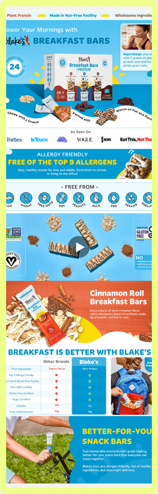
This one turned into a full case study for us. Blake's came to us already running ads and already driving traffic, but stuck at a plateau they couldn't figure out how to break through. Once we updated their content, they saw a 472% increase in sales within 30 days.
The hero shot above the fold shows the full flavor family at a glance, paired with close-up shots designed to make you hungry, a cinnamon bun shot so detailed you can practically smell it. Without that image, you might miss that cinnamon roll was even a flavor. Product-in-use scenarios run throughout, a kid taking a bar to school, a family on a road trip, so parents can picture it in their own routine. And because allergies matter here, that information sits as close to the top of the fold as possible instead of making a parent go digging for it.
Key takeaway: If your product has a family of flavors, show them together above the fold. Shoppers should see the full range before they see anything else.
2. Chickpea Hearts
Source: Chickpea Hearts
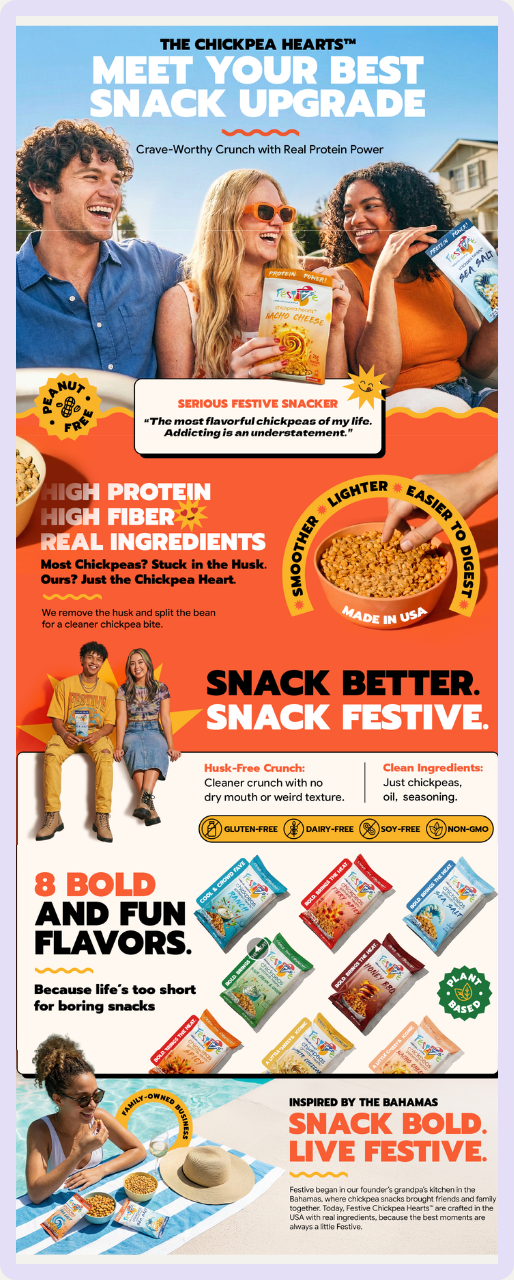
Even though we didn't design this one, it's hard not to admire it.
Big, bold lifestyle images of genuinely happy people carry most of the page. Video and custom banners are layered on top of each other in a way that never disrupts the flow, so the whole thing reads top to bottom like a landing page instead of a stitched-together product listing. Nothing feels cluttered. The fonts are big, the personality is loud, and the color palette does a lot of the emotional lifting on its own.
Key takeaway: Layering video under custom banners is a great way to add movement without sacrificing a clean, seamless design.
3. Tosi
Source: Tosi
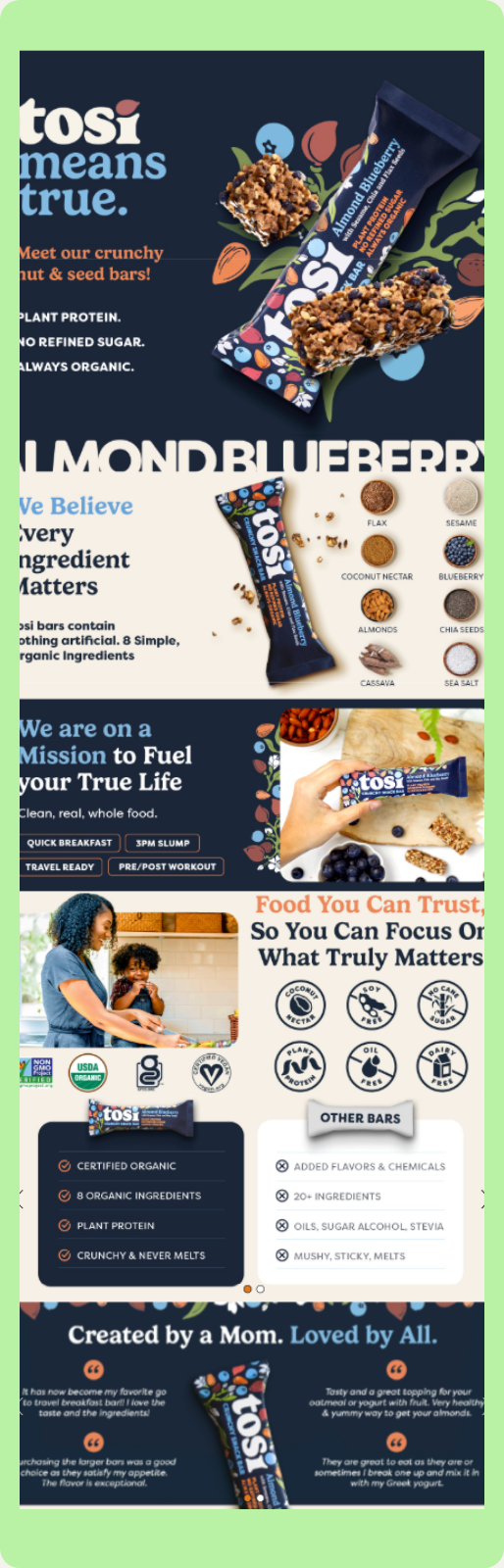
Tosi came to us after a rebrand, which meant we got to build their content around a real photo shoot instead of leaning on renders. Every photo on this page is real.
Authenticity is the whole strategy, and it starts with the name itself. Tosi means "true," and that idea runs through the page. There's a founder story, "from our family to yours," and real photos of the people behind the brand instead of polished stock images standing in for them. Trust badges like US-owned and female-owned sit right alongside it. Small additions like these tell a shopper this is a real brand run by real people, not a faceless company they can't picture.
Key takeaway: If you're nervous about showing your face as a founder, this is your sign to do it anyway. It builds more trust than any badge alone.
4. Little Spoon
Source: Little Spoon
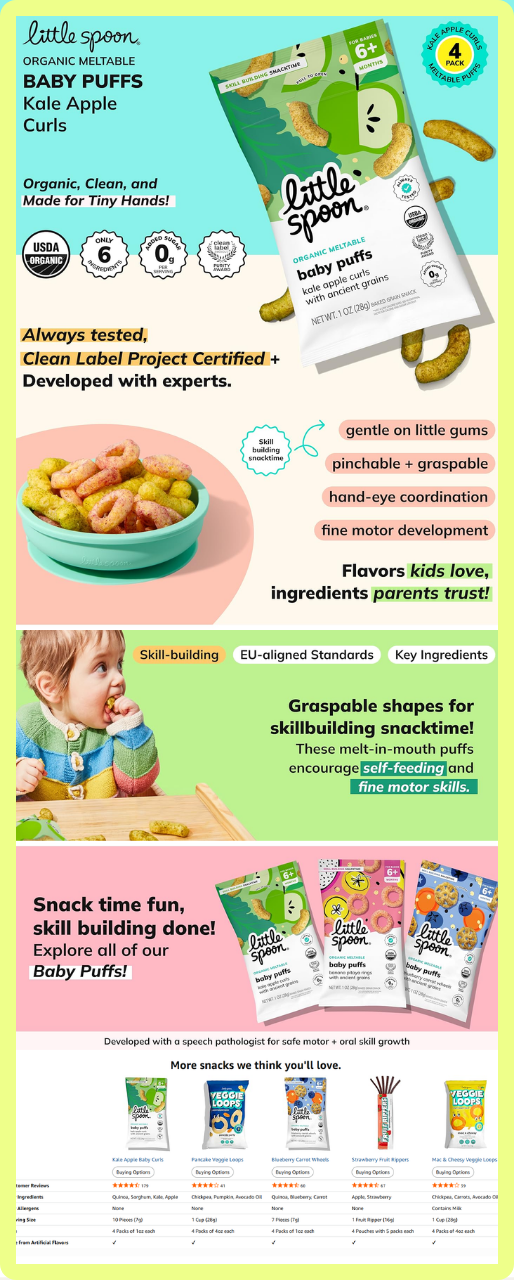
We didn't work on this one, but it speaks to one very specific shopper extremely well: a parent who needs to know a product is clean, verified, and safe before anything else matters.
The color blocking is pulled straight from the packaging, and the copy goes past "tastes good" into functional benefits like fine motor skills and hand-eye coordination, which not every snack brand can honestly claim. Every module reinforces that reassurance. Everything their ideal shopper needs to add them to cart. A shot of a child eating it in a high chair captures the exact moment every parent recognizes instantly.
Key takeaway: Speak to the specific fear your shopper has, not just the product's features. For a baby snack brand, that fear is usually safety first, taste second.
5. Hippeas
Source: Hippeas
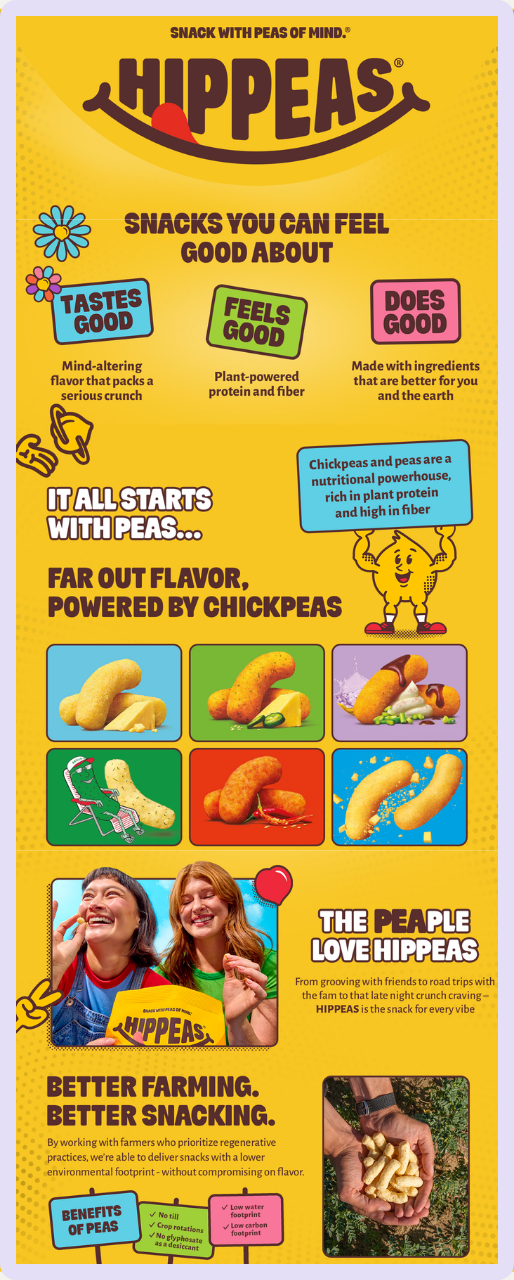
This one stands out for a single interactive detail: a hotspot banner. It looks like a shoppable link, but it's actually a clickable module that reveals more information, in this case, different flavor details, when tapped.
The reason this matters is dwell time. Every extra second someone spends interacting with your page, clicking to reveal more, watching a carousel, playing a video, signals to Amazon that shoppers are engaging more with your listing than a competitor's. That's a real ranking signal, not just a design flourish. Worth noting: this particular module doesn't render as well on mobile yet, so test yours on a phone before you lean on it.
Key takeaway: Interactive modules like hotspot banners increase dwell time, which is a real signal to Amazon, but always confirm they work on mobile before you commit to one.
6. Kodiak Cakes
Source: Kodiak Cakes
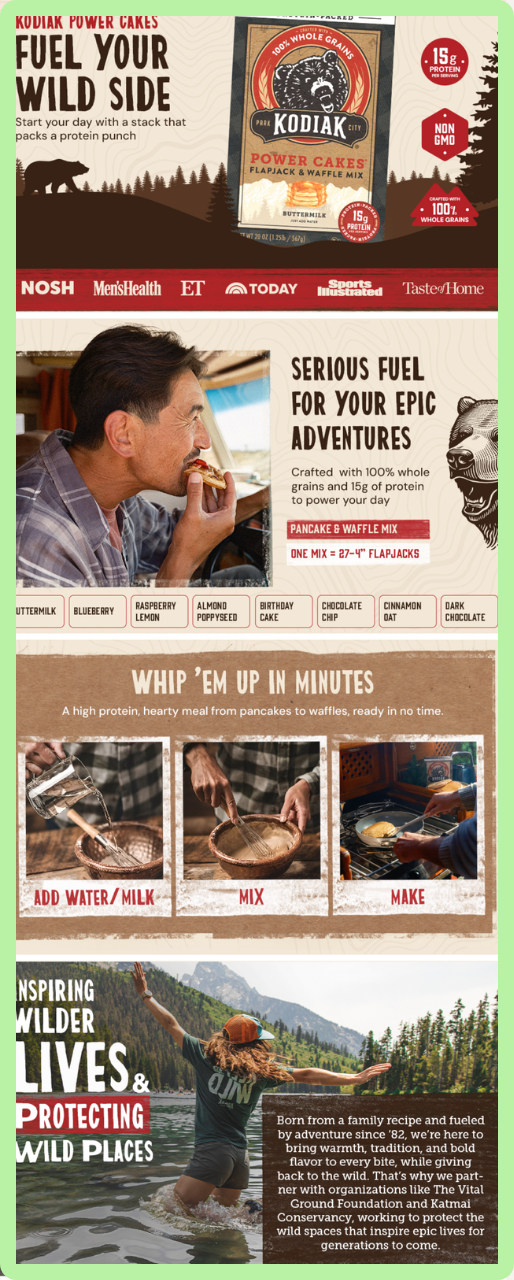
Kodiak Cakes sells on Vendor Central, which meant we were limited to basic A+ content.
This page is proof that basic doesn't have to mean boring. Even without carousels, background video, or interactive modules, there's still real intention behind the layout and the messaging, showing and painting the lifestyle of your ideal shopper.
Key takeaway: if you're on Seller Central and already have free access to premium A+ content, use it. But if you're stuck with basic, this is proof you can still build something worth looking at.
7. Yes Bar
Source: Yes Bar
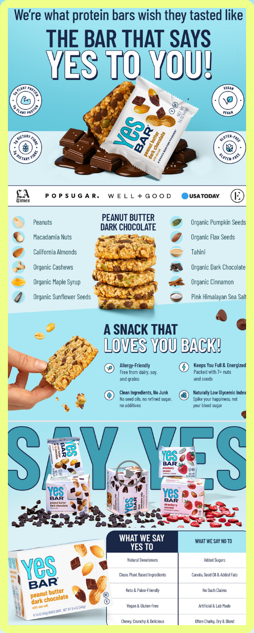
Yes Bar is one of our all-time favorite clients. They came to us mid-pandemic with a rough sense of the aesthetic they liked but no clear way to execute it. We took their content to the next level, and once they saw it working, they invested in a full branding refresh, then came back for another round.
That's what we mean by step-laddering your brand identity: building it in stages as you grow, instead of waiting until you have $50,000 to drop on a full rebrand at once. This page also pulls in UGC and influencer video straight from their own Instagram and TikTok, so a shopper who's already seen the brand on social recognizes it instantly on Amazon.
Key takeaway: you don't need a finished brand identity to start. Elevate what you have now, then let it evolve in stages as your budget grows.
8. Momofuku
Source: Momofuku
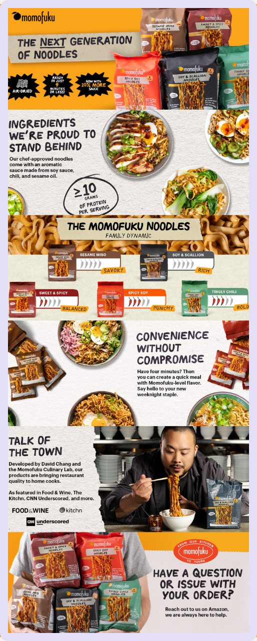
This was a different kind of project for us. Momofuku walked in with everything already done, branding figured out, packaging finished, a full photo shoot ready to go. They didn't need us to build their identity. They needed speed and execution.
When a brand hands you real ingredients, packaging cues, close-up food photography, founder video of David Chang cooking, media mentions, you get to focus entirely on structure instead of building assets from scratch. This page makes spice level and flavor differences easy to understand in under 15 seconds of scrolling, in a category that's historically felt old and boring to a lot of shoppers who assumed shelf-stable ramen meant low quality. It became an Amazon bestseller shortly after launch.
Key takeaway: if you've already invested in packaging, photography, and a founder story, your A+ content's job is just to organize it clearly, not reinvent it.
9. Feel Good Foods
Source: Feel Goods Foods
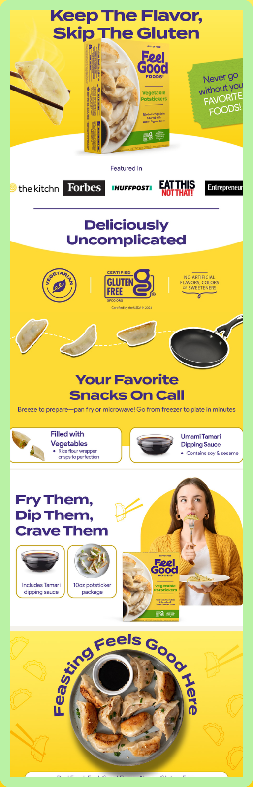
We got to work on this one, and the strategy here is really about closing the gap between what a shopper imagines and what they actually get.
This page shows exactly what's inside the box before you buy it, the wrapper, the filling, the sauce, so there's no surprise waiting at home. Unmet expectations are one of the fastest ways to lose a repeat customer. The page also does a balanced job of showing and telling: it tells you that you can pan-fry or microwave it, freezer to plate in minutes, then shows you exactly that, chopsticks lifting a dumpling, a pan waiting, someone actually eating it.
Key takeaway: don't just describe how your product works, show it happening. Pair every claim with the visual proof of it.
10. Yumi
Source: Yumi
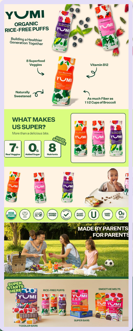
If there's one thing this page nails, it's speed of trust. A shopper only has five to ten seconds to take in a page, and this one gets a health-conscious parent to "okay, I trust this" almost instantly.
Instead of burying nutrition claims in paragraphs, everything is broken into small, specific, visual callouts: 8 superfood veggies, Vitamin B12, as much fiber as a cup and a half of broccoli. Numbers a parent can process at a glance, mid-scroll. A full badge wall follows right underneath, organic, gluten-free, women-owned, school-friendly, dairy-free, zero added sugar, checking off nearly every concern a scrutinizing parent might have in one visual sweep. It closes by showing the full product lineup, so a parent who trusts this one bag walks away considering the whole brand.
Key takeaway: when you're speaking to a scrutinizing shopper, quantify your claims and put them where they can be scanned in seconds, not read in paragraphs.
What this list has in common
None of these brands are just listing ingredients and hoping for the best. Every one of them builds their content around one specific shopper and one specific hesitation, whether that's a parent checking for allergies or a shopper wondering if ramen from a shelf can actually taste good.
If you're a food brand figuring out where your own A+ content stands, use this list as a benchmark. Find the brand whose shopper looks most like yours, and ask whether your content is doing what theirs is doing. If it's not, that's where to start.
Enjoyed this roundup? We've got another one. Take a look at our guide to the 10 Best Amazon A+ Content in the Beverage Category for 2026 for more examples of brands getting Amazon creative right.
