
5 Ways to Create Amazon Product Images That Make Shoppers Click

Six little squares. That's all Amazon gives you before a shopper decides whether your product is worth a second look or a scroll past.
If your current listing is filled with images of your product at the front, a photo of the back, a photo of the side, and maybe a flatlay borrowed from Instagram, it’s no surprise why your listing isn’t converting.
My team and I has spent close to a decade doing nothing but Amazon creative — images, A+ content, storefronts, SEO — for hundreds of brands. This guide walks you through the exact five things we look at when auditing a listing that isn't converting, and what we tell clients to fix first.
Quick summary: How to create Amazon product images that shoppers click
Give every image a single job: Each image in your stack is its own sales pitch. Pick one point per image, pair it with a bold, simple headline, and stop cramming five ideas into one slide.
Humanize your visuals: All-render or all-AI image sets read as generic and erode shopper trust. Mix in lifestyle photography, real people, or founder shots to make the brand feel real.
Keep your content current and distinctly branded: Outdated or generic, Fiverr-style visuals make even established brands look untrustworthy. Refresh your full image set at least once a year.
Design mobile-first and use all six slots: Roughly 70% of Amazon shopping happens on mobile, where your images stack like a landing page. Two images is leaving money on the table.
Test with data, not gut feel: Use tools like PickFu to pressure-test designs before they ever go live, then let Amazon's own experiments confirm the winner.
Skip to:
1. Give every image a single job
The single biggest mistake I see, over and over, is what I call "bland Images." This is where Amazon sellers fill their listing with images of the product front shot on white, a back shot on white, a side of the packaging, and maybe a flatlay.
Technically they are fine photos, but nothing that grabs attention or tells a shopper why your brand deserves a spot in their cart.
Attention is the whole game on Amazon, so every image needs to serve one function. It needs to do the functional job of selling your product.
When a shopper lands on your listing, they have three to five questions already in their head. If your images don't answer those questions fast, they bounce. So instead of treating your six image slots as six angles of the same product, treat each one as its own small sales pitch — make one point, visually and in a few words of copy, and make it unmistakable.
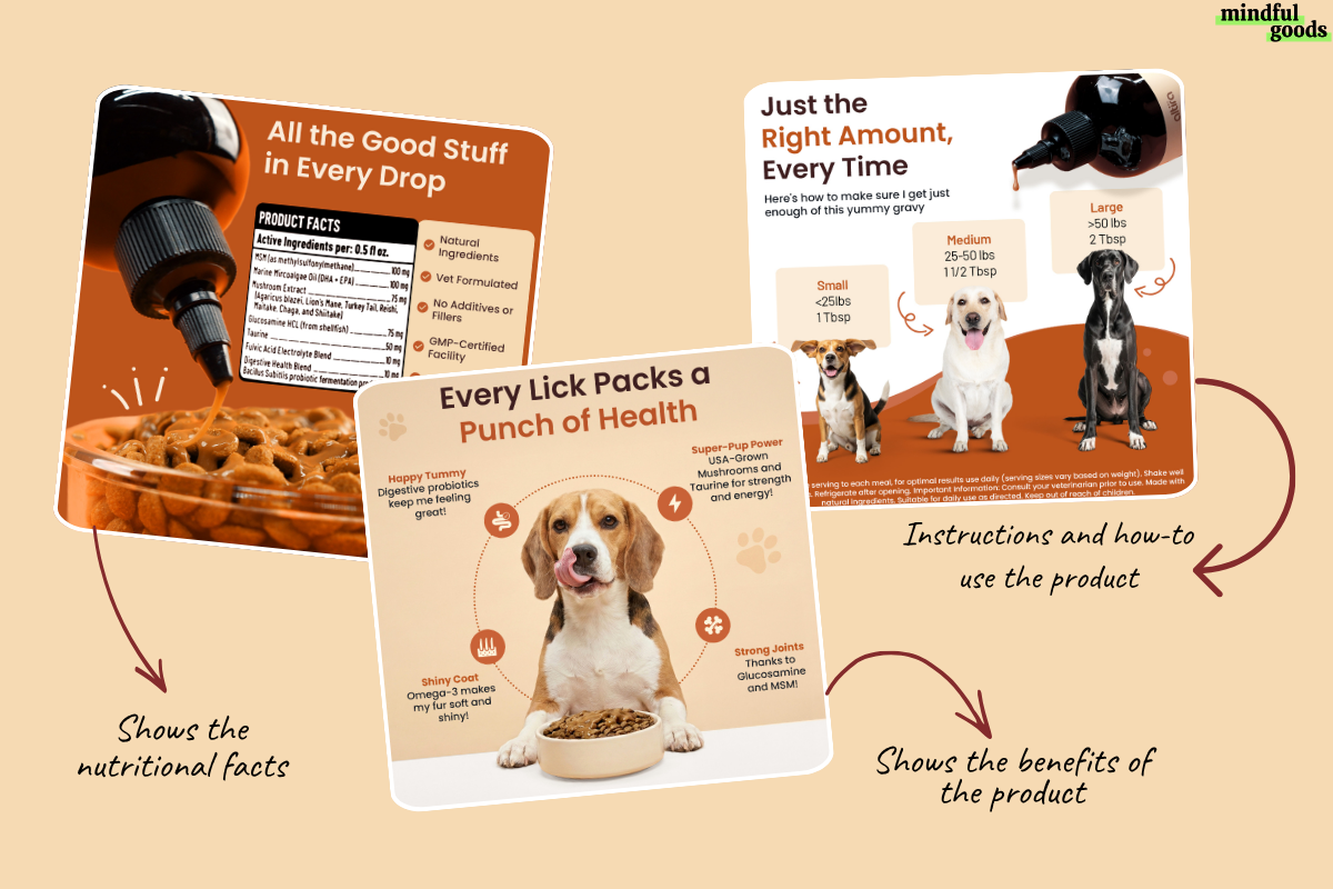
Amazon Product Image Stack for a Pet Food Brand
So what are those three to five questions, exactly? The questions are already sitting in a few places, you just have to go look:
Your product reviews: Look at the recurring language customers use tells you exactly what convinced them, or what almost made them pass and lead with that.
The voice search / chat bubble: find the kinds of questions people ask Alexa or an AI assistant about similar products. There’s a high chance is mirrors what they're silently wondering while scrolling your listing
Your listing's Frequently Asked Questions section: This one is a direct list of what shoppers are still unsure about. Go ahead and answer them in your product image.
Your own customer support history, if you sell direct-to-consumer elsewhere too, you've probably answered these same questions a thousand times already. Find them and answer it.
All that is to say,
A bold, simple headline on every image that states the single takeaway
One clear visual idea per slide, not a laundry list of features
Text a shopper can absorb in a couple of seconds, not a paragraph they have to squint at
Think of it as five or six separate billboards, not one long brochure spread across six panels. Shoppers can only take in so much at once, so my rule of thumb is that people can process around five key things about a product, max. Past that, you're just adding noise.
2. Humanize your Images, not just Renders and AI
3D renders used to be the shortcut. Now it's AI. Either way, It’s the same problem, a whole image set that's 100% computer-generated, and impersonal. Nothing about it looks custom, or personal, or like it belongs to a real brand. And the second a shopper senses that, even subconsciously, you start losing them. It feels fake, they don't trust it, and instead of pulling them in, you're quietly pushing them away.
Look at your product images right now, if your competitor can slap their brand name on it and your shoppers won’t notice the difference, you’ve got work to do.
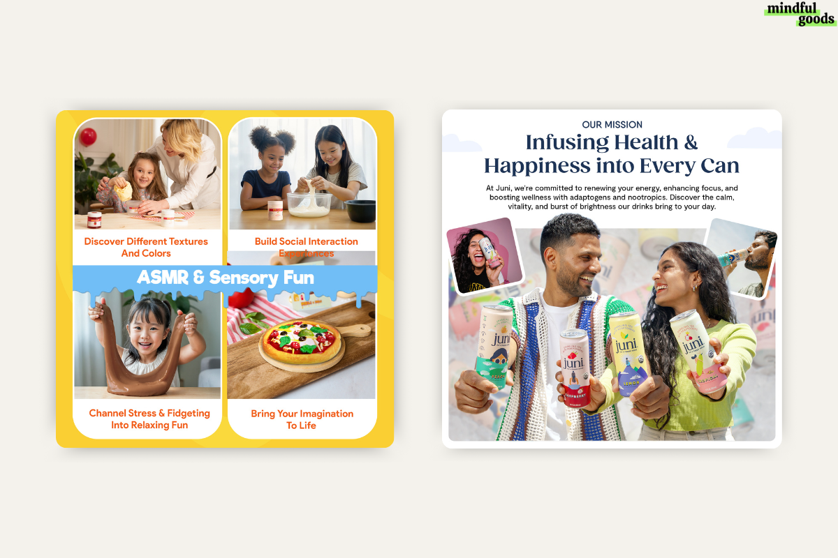
Examples of Product Images showing the “Human-side“ behind the brand
I'm not telling you to throw renders out. I'm telling you to blend them with something human: a founder photo, an influencer shot, someone actually holding the product, a few natural elements in the background. You don't need a full photoshoot to do this. Even small, well-placed human touches are enough to make a listing stop feeling static and stale, and start feeling like it belongs to actual people.
3. Test with real shopper data before you publish anything
This is where my process probably diverges most from what a lot of sellers do. Instead of designing one image, uploading it, and hoping, validate your image before anything goes live on Amazon.
Here's what our process looks like step by step:
Generate a wide range of design concepts for your images. Sometimes you need to design something a couple different ways to make sure that people see it, and they, and they understand it. I usually start with 15–20 directions.
Test the strongest 2–3 against the current live image using a tool like PickFu, which polls real Amazon Prime shoppers and can target by category-relevant buying behavior
Use the vote count and the "why I chose this" feedback to refine the design
Once a variant tests well, run it as a formal Amazon experiment to confirm it with real traffic
Why the extra step? Amazon's built-in experiments need four to ten weeks to reach significance. PickFu gets me directional results in about 30 minutes, so I'm not gambling weeks of ad spend on a hunch.
By following those steps and building in this layer of split testing your content and making sure that you're validating your content, we've seen brands improve their sales by up to 2500% within 30 days. So don’t rely purely on your own taste, even with an experienced team. I've had my whole creative team unanimously prefer one direction, only for the data to show shoppers clearly preferred another. Preference isn't the same as performance.
4. Design for Mobile Shoppers
Amazon shopping happens on mobile. In fact over 70% of shoppers are swiping your listing on their mobile. That means on a phone, your images stack straight down the top of the screen before a shopper even gets to your title. So your images is basically your landing page, and shoppers are scrolling, not studying.
That changes how you design each image.
If there's small text or backend packaging details crammed into a photo, nobody's reading it on a phone screen. Every image needs to make its point at a glance: one clear visual, a headline big enough to read at thumbnail size, and nothing that requires zooming in to understand. I always pull it back to the basics — the customer needs to know what the product is, how they use it, and one or two real benefits. That's it. Anything more than that and you're just making them work for information they'll skip past anyway.
5. Make your images unmistakably you
Tell me, when was the last time you actually bought from a random stranger with a shaky website, or no real brand behind it at all? Shaky, right?
That's exactly what happens when a shopper comes to your listing from social, from an ad, or even from a friend recommending your product and what they find on Amazon doesn't match what they saw or heard.
Generic content creates that same disconnect, even without a bad website involved. If you're competing against a dozen other sellers, or resellers, pushing the same or similar product, and your listing looks like everyone else's, the only thing left for a shopper to compare you on is price. That's a fight you don't want to be in.
Bringing your whole brand to Amazon is more than making things look cohesive. It's making sure the same experience a shopper gets on your own website, your packaging, your socials, shows up on your Amazon images too, so there's no gap for them to notice.
Pull your actual colors, your fonts, the icons or patterns already on your packaging, straight into your images. When you do that consistently, a shopper should be able to see your image stack without the logo and still know it's you. And that's what actually gets you out of competing on price, stop being interchangeable with the next seller and start being the brand they already trust.
Here's what I have my clients do:
Pull visual cues directly from your own packaging (colors, patterns, icons) so the digital shelf matches the physical one
Carry over the tone and personality from your DTC site or socials, instead of defaulting to generic Amazon template language
Layer in trust signals, like certifications, badges, and callouts, that are specific to your product, not generic stock icons
Bonus: Refresh your content regularly
Even a strong, distinct brand can hit a plateau on Amazon. I've audited brands that have been on Amazon for a decade or more and are still losing market share to newer competitors simply because their visuals haven't kept pace. If it looks outdated, shoppers assume the brand itself is behind. Plan a full creative refresh across your main images, A+ content, and storefront at least once a year — ideally in Q1 or Q2, not during your peak Q3/Q4 selling season.
Bringing it all together
None of this requires a full studio and an unlimited budget to start. Pick the step that's costing you the most right now. Maybe it's an image set that hasn't been touched in three years, or a stack that's still sitting at two images, and fix that first. Then build toward the habit of testing before you commit, so every future refresh is backed by data instead of a guess.
FAQ about Amazon product images
How many product images should I use on Amazon?
Use as many image slots as you can fill with images that actually earn their place — each one should answer a distinct shopper question. Don't leave a slot empty just because you've run out of obvious angles to shoot.
How often should I update my Amazon product images?
Plan a full refresh of your main images, A+ content, and storefront at least once a year, ideally outside your peak selling season. Layer in smaller split tests throughout the rest of the year to keep improving incrementally.
Are AI-generated product images okay to use on Amazon?
They can work as part of your image set, but an entirely AI-generated or rendered stack tends to look impersonal and can undercut shopper trust. Blending renders with real lifestyle or human elements tends to perform better.What's the best way to A/B test Amazon product images?
Pre-test design concepts with a third-party polling tool (like PickFu) before uploading anything, since it gives you directional feedback in about 30 minutes instead of the four-to-ten weeks Amazon's built-in experiments typically take. Once a concept tests well, confirm it with a formal Amazon experiment.Does the main image matter more than the rest of the stack?
It carries the most weight since it's what shoppers see first in search results, and it's worth testing most aggressively — but the rest of the stack still drives the actual conversion once someone clicks in. A strong main image with a weak stack behind it still leaves sales on the table.
