
10 Amazon Supplement Storefronts Doing It Right (And What You Can Learn From Them)

People don't buy supplements because they enjoy taking capsules. They buy them because they want to feel better, stay healthier, and improve their quality of life.
On Amazon, however, hundreds of brands promise similar outcomes. Many offer comparable ingredients, make similar claims, and compete within the same price range. When products look alike, shoppers need to rely on something else to decide who they trust.
That something else is your storefront.
Just displaying a catalogue of products doesn't cut it anymore, your storefront is where shoppers form their first impression of your brand, decide whether you seem credible, and choose whether to "add to cart" or scroll away.
That's why at Mindful Goods, after analyzing more than 150 split tests across supplement brands, we know — backed by data — the elements that influence shopper behavior. We compiled the results into our Supplement Playbook for supplement brands looking to improve their Amazon creative and increase conversions.
To see some of these principles in action, we looked at 10 supplement brands with standout storefronts. Some are brands we've partnered with, while others are simply brands we're keeping a close eye on because they're raising the bar for Amazon creative.
Here's what they're doing well, and what you can learn from each one.
Top 10 Best Amazon Storefronts in Supplement Category
Enviromedica: Does more with less, spacious layout, quiet trust-building
Lemme: Consistent purple branding makes even AI visuals feel intentional
Lovebug: Leads with credibility, awards and badges designed to feel native to the brand
MyOva: Value and differentiation clear from the first scroll
Thorne: Every visual tells the same clinical, trustworthy story
Ancestral Supplements: Shows the full product family early to signal expertise
MaryRuth's: Carries social media energy straight into the storefront
By the way, if you’re more of a visual learner, we broke it all down on YouTube.
1. Enviromedica - Doing More With Little
Source: Enviromedica
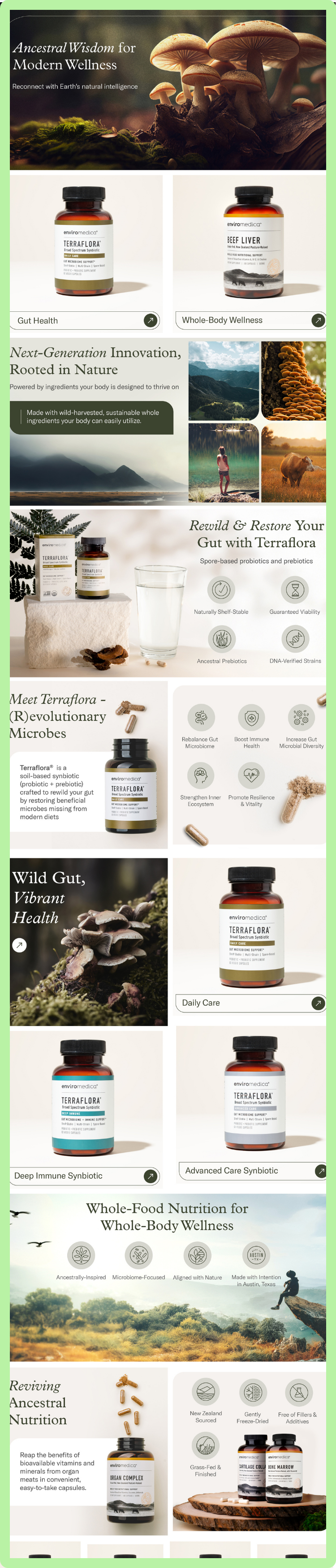
Enviromedica's storefront is one of the many storefronts we’ve created here at Mindful Goods. And here, what we wanted to prove is that less really can be more.
With a smaller product catalogue, the brand resists the temptation to fill every inch of its storefront. Instead, each product has room to breathe. The layouts feel spacious, the navigation is simple, and the darker colour palette and nature-inspired imagery strike a balance between wellness and clinical credibility.
Rather than relying on bold claims, the graphics and visuals quietly build trust—something every supplement brand should prioritize when customers are trusting you with their health.
Takeaway: If you have a smaller catalogue, don't feel pressured to fill every part of your storefront. Let your products breathe, tell a consistent brand story, and make it easy for shoppers to find what exactly they need.
2. Lemme - Consistency Builds Recognition

Source: Lemme
Lemme proves that consistency can become part of your brand identity.
The signature purple colour appears throughout the storefront, making every section instantly recognizable. Even as shoppers move from one product to another, the visual identity stays the same, making the brand feel familiar and intentional.
Lemme also shows that AI-generated visuals can work—when they're used carefully. In the supplement category, where trust is everything, visuals that feel overly artificial can make shoppers hesitate. Here, the AI imagery complements the brand instead of distracting from it, helping maintain the quality, polished experience shoppers expect.
What you can learn: Whether you're using photography, illustrations, or AI-generated assets, consistency matters. Every visual should reinforce your brand, not make customers question it.
3. Lovebug - Lead With Credibility

Source: Lovebug
Lovebug's storefront was created by, you guessed it, us — the creative agency at Mindful Goods. And here, trust was exactly what we set out to build.
Trust grows faster when it's backed by proof.
Lovebug places its awards and recognitions alongside its bestselling products, giving visitors immediate reassurance that the brand has earned external validation.
What stands out even more is how those badges are designed. Rather than looking like generic clip art pasted onto the page, the badges feel like a natural extension of the brand. Combined with cheerful lifestyle imagery and a consistent colour palette, these details make the brand feel more trustworthy.
What you can learn: Awards, certifications, and media mentions can strengthen trust, but only if they look authentic. Present your credibility with the same care you give the rest of your brand.
4. Seed - Bring Shoppers Into Your Brand World

Source: Seed
Seed doesn't start by selling products. It starts by selling the idea behind them.
Instead of opening with products or bestsellers, the storefront immediately explains why gut health matters, giving shoppers a reason to care before asking them to buy.
From there, exploring the catalogue feels effortless. A product family image with interactive hotspots helps shoppers quickly find what they're looking for,while user-generated photography and background videos make the brand feel real and approachable.
By the time shoppers reach the products, they've already been introduced to Seed's mission. The storefront feels less like a catalogue and more like an invitation into the brand's world.
What you can learn: Don't start by asking shoppers to buy. First, help them understand why your brand exists. When people connect with your mission, they're more likely to explore what you have to offer.
5. MyOva - Show Your Value Early
Source: MyOva
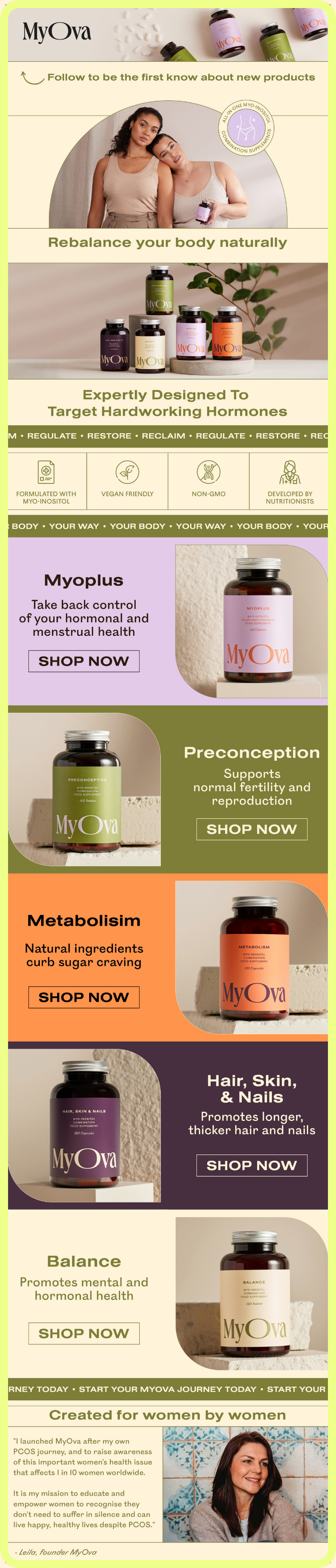
MyOva is another brand we've had the pleasure of working with, and if there's one thing we wanted shoppers to feel from the first scroll, it's clarity.
Instead of making visitors dig for information, the storefront immediately highlights what sets the brand apart—from its formulation to its vegan-friendly ingredients and nutritionist-developed products. By the time visitors begin exploring the catalogue, they already understand what the brand stands for.
That clarity continues throughout the storefront as colour categorisation helps shoppers distinguish between products at a glance, making the catalogue easier to navigate, especially for a smaller product range. It's a simple design choice that removes friction from the shopping experience.
The storefront closes with founder Leila's story, sharing the personal journey that inspired the brand. It's a reminder that people connect with people. Our split testing has consistently shown that founder stories increase trust by reminding shoppers they're buying from real people with real experiences, not just another supplement brand.
What you can learn: Make your value obvious from the start. The easier it is for shoppers to understand your brand, the easier it is for them to choose it.
6. Thorne - Let Every Visual Tell The Same Story
Source: Throne
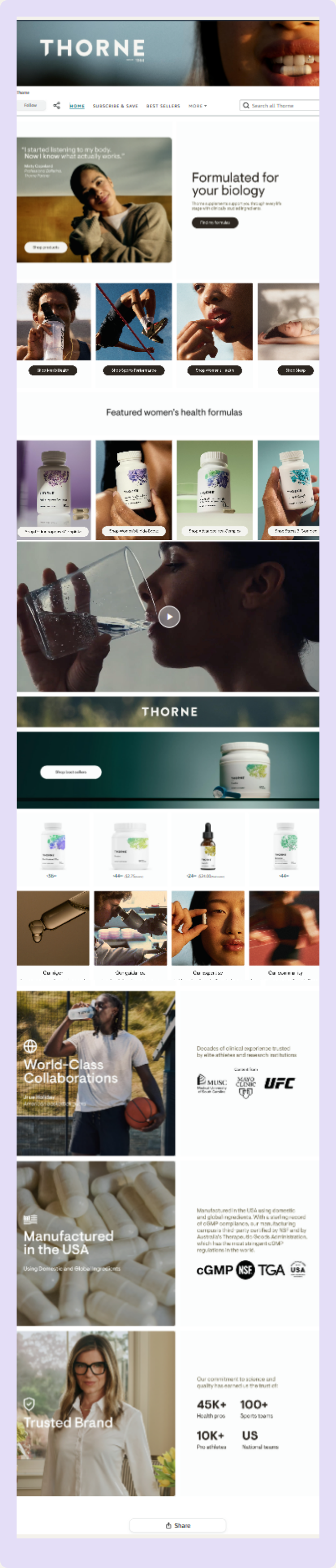
Few supplement brands command as much trust as Thorne, and its storefront shows exactly why.
The combination of a darker color palette and clean white space creates a look that feels both clinical and credible. Every word, visual, and design choice works together to create the kind of experience shoppers naturally associate with quality and trust.
The photography brings it all together. Every image looks like it came from the same photographer and the same photoshoot. That level of consistency signals careful attention to detail—something shoppers instinctively associate with brands they can trust.
The takeaway: Great storefronts aren't built on one standout design element. They're built on dozens of thoughtful creative decisions that work together to tell the same story and earn shoppers' confidence.
7. Ovii - Answer Questions Before Shoppers Ask Them
Source: Ovii
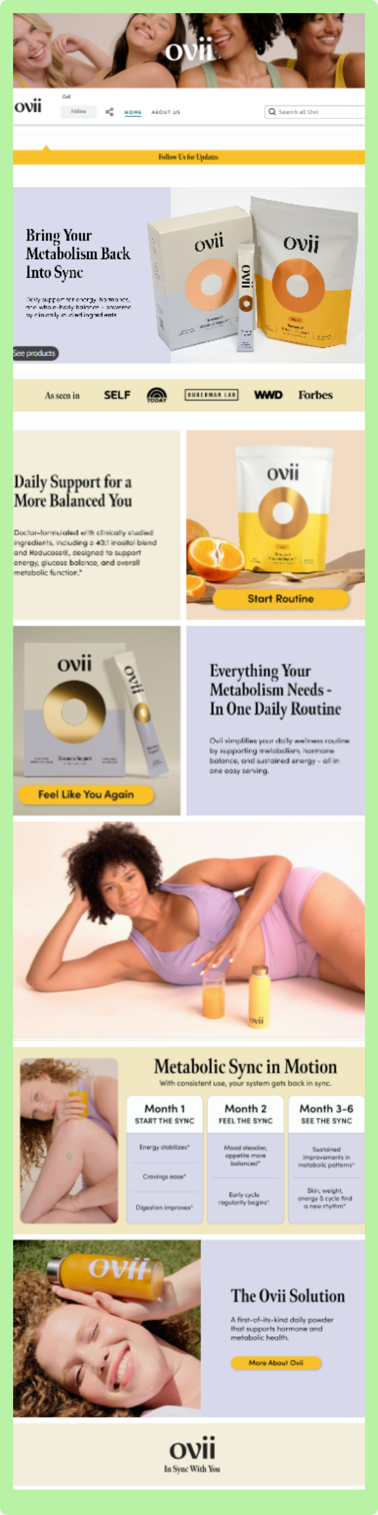
One of the quickest ways to lose a shopper is to leave them with unanswered questions. Ovii's storefront is a great example of how to do the opposite.
It also shows what brands with smaller product catalogues can do well: use large, bold product images. Instead of trying to fill every inch of the page, each product has room to stand out while clearly communicating what it's for.
As shoppers continue scrolling, the storefront builds even more trust. They feature people of different ages, body types, sizes, and skin tones in a background video, making the brand feel welcoming and inclusive. Rather than simply showing products, it helps shoppers see themselves in the brand.
Another feature in their storefront is the product timeline. Instead of promising overnight results, it shows shoppers what progress looks like over time and sets realistic expectations from the start. In our split testing, storefronts that include timelines tend to see more repeat purchases because shoppers already understand that supplements need to be taken consistently to see results.
What you can learn: Every section of your storefront should answer a question. When shoppers understand what your product does, who it's for, and what to expect, they're more likely to buy with confidence.
8. Ancestral Supplements - Show Shoppers You’re the Expert
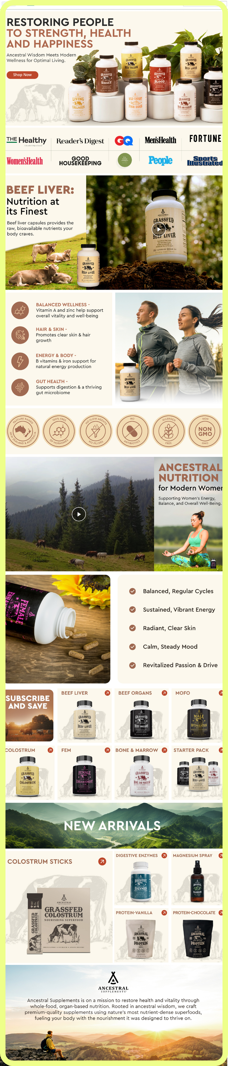
Source: Ancestral Supplements
Another one from the Mindful Goods playbook, Ancestral Supplements. Here, the goal was simple: make expertise impossible to miss. Having multiple products is one thing. Making shoppers notice them is another.
Ancestral Supplements doesn't wait for shoppers to discover each product in the catalogue. Instead, it introduces its product family from the very first scroll. It's a simple choice, but an effective one. Seeing multiple products together immediately makes the brand feel more established and suggests it has expertise beyond a single supplement.
That first impression is quickly reinforced with recognizable media mentions placed near the top of the storefront. Before shoppers even begin exploring, they're met with another signal that the brand has earned attention beyond Amazon. As they continue scrolling, custom icons, background videos, and a consistent visual style continue to build that same sense of trust.
What you can learn: If you offer more than one product, don't make shoppers piece your catalogue together themselves. Show the bigger picture early, then reinforce your credibility with proof that others already trust your brand.
9. ARMRA - Support Every Claim With Evidence

Source: ARMRA
Claiming your product is different is easy. Giving shoppers a reason to believe you is where the real work begins.
Instead of relying on marketing copy alone, ARMRA backs its claims with clinical proof and statistics, giving shoppers evidence they can use to make informed decisions. The same principle applies to customer feedback. One practical takeaway here is to collect insights from your own customers through surveys and use their experiences to strengthen your creatives. Sometimes the most convincing proof comes from the people already using your product.
Another standout feature is the cost comparison module. Rather than drawing attention to the product's price, it reframes the conversation around value by showing shoppers how much they could spend buying multiple supplements separately. It's a simple shift that makes the purchase feel like a smarter long-term investment.
The experience ends just as strongly as it begins. Custom badges continue to reinforce credibility, while a simple founder story and signature add a human touch, reminding shoppers there's a real person behind the brand.
What you can learn: Every claim creates a question in your customer's mind. Answer it with proof. Whether it's clinical research, customer feedback, comparison charts, or your founder's story, the strongest storefronts make it easy for shoppers to believe what you're saying.
10. MaryRuth's - Carry Your Marketing Into Your Storefront

Source: MaryRuth’s
MaryRuth's has become one of the brands everyone in the supplement space is watching.
The brand has built a strong reputation through user-generated content and social media, particularly on TikTok. Instead of treating Amazon as a separate experience, the storefront builds on that momentum. The same vibrant personality, visual style, and storytelling shoppers see elsewhere continue seamlessly on the storefront, making the brand instantly familiar.
Right from the first scroll, shoppers are introduced to the full product range, reinforcing that MaryRuth's offers more than just one bestseller.
Colour blocking keeps the catalogue easy to browse, while a simple founder story and trust badges provide a reassuring finish without overwhelming the page.
What you can learn: Your storefront shouldn't feel disconnected from the rest of your marketing. When every customer touchpoint tells the same story, shoppers recognise your brand more quickly, and trust it more easily.
Final takeaway
The best Amazon supplement storefronts don't all look the same, but they do share one thing in common: they make it easy for shoppers to trust the brand behind the product.
Whether it's thoughtful design, clinical proof, founder stories, consistent branding, or a well-organized catalogue, every element works together to answer the same question: Why should I trust this brand with my health?
You don't need the biggest catalogue or the biggest budget to apply these ideas. Start by improving one part of your storefront, then build from there. Over time, those small, intentional decisions create a shopping experience that feels more credible, more memorable, and ultimately more likely to convert.
Enjoyed this roundup? We've got another one. Take a look at our guide to the 10 Best Amazon A+ Content in the Beauty Category for 2026 for more examples of brands getting Amazon creative right.
